
“Hosking brings a fresh, funny twist to the classic format, turning each letter into a mini adventure full of surprises and humor. If you think alphabet books are boring, this one will change your mind!
Gifford paints every page with lively, eye-catching colors and playful scenes. Her art makes the story jump off the page and keeps kids (and grown-ups!) fully engaged. It’s a visual feast that perfectly matches the book’s fun tone.”
“A winning threefer: an alphabet book, a conflict-resolution story, and a rib-tickler...
Just when it seemed the world was out of interesting ideas for alphabet books, along comes this corker, which offers a lesson in the ABCs while telling a compelling, immensely funny story. ”
A IS FOR A RABBIT’S TALE
Written by JACKIE HOSKING and published by WALKER PRESS 2025
A is for A rabbit.
B is for Buy this book!
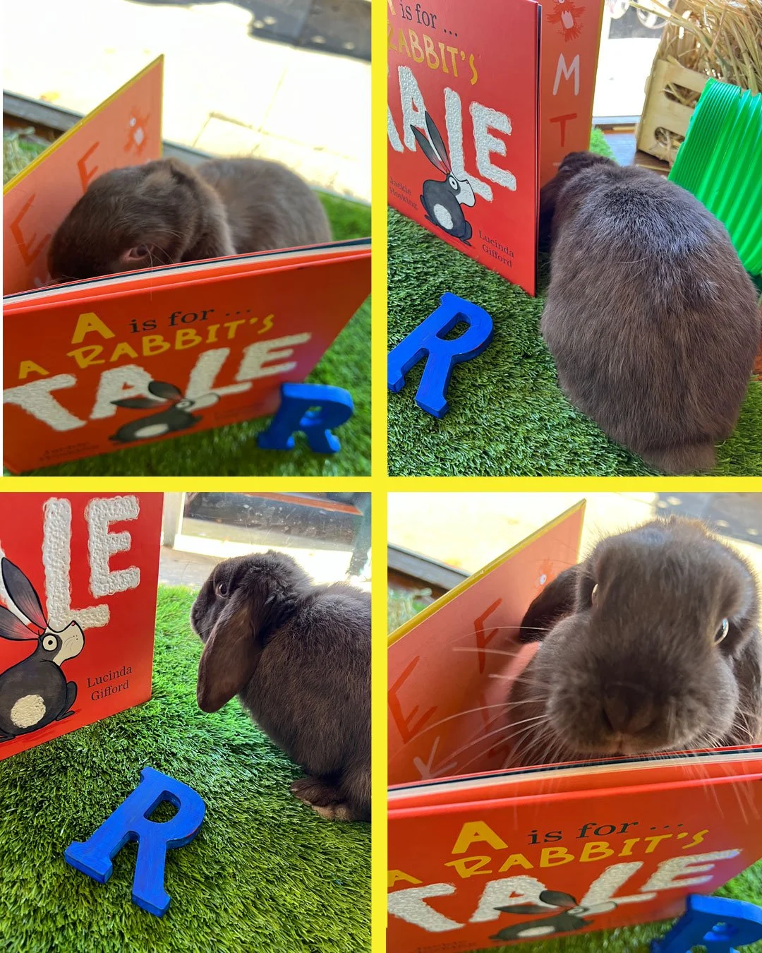
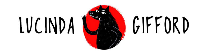
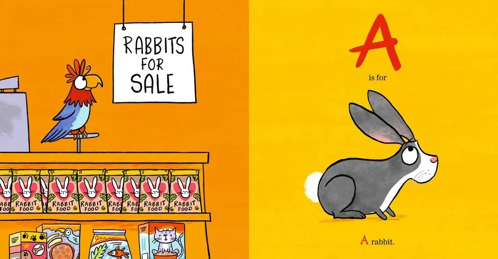
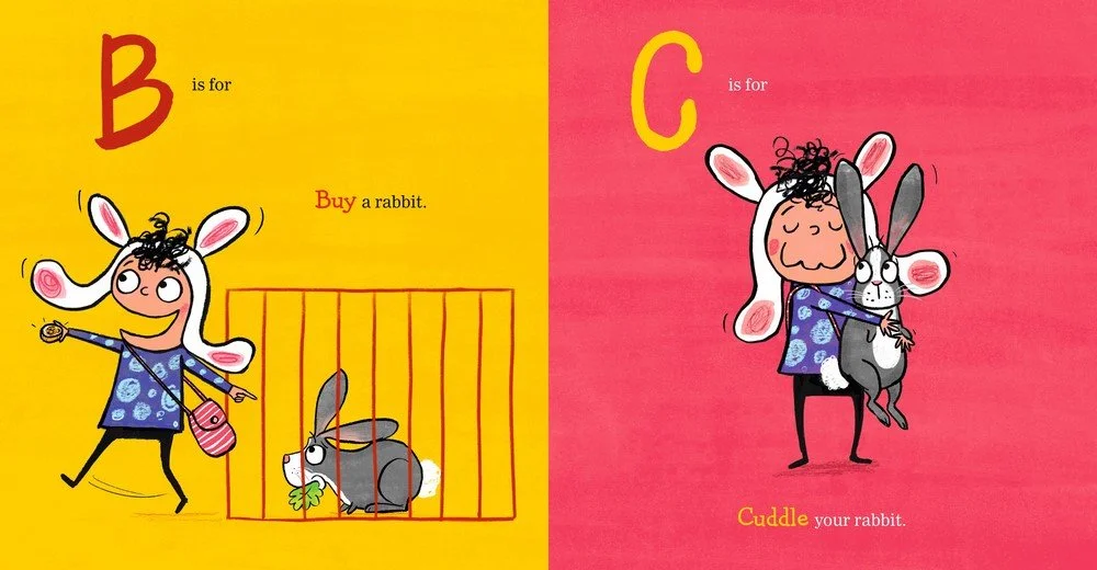
I love illustrating this quirky story by the talented Jackie Hosking. It’s always a good sign when I start giggling halfway through reading the text! Here are some spreads below, and some of my development drawings, as well as a photoshoot with a rather perplexed bunny called Timmy…
Go here for a some activity sheets, and here for classroom ideas by Walker Books/Lamont Books.
Oooh - and here for a lovely USA review from the prestigious KirkusReviews.com.

Storyboarding
I started doing a storyboard (on my iPad) and, rather quickly, I became frustrated with creating tiny little drawings (thumbnails) and was keen to get straight onto the next stage. This was because I could already see in my head how I wanted the illustrations to look.
This doesn’t happen with every book, but for ‘A Rabbit’s Tale’ I needed to see everything in more detail; much of the book relied on the character’s expressions and body language, as well as the colours I would choose. I often use colours to express emotion - and this book has a LOT of emotion.
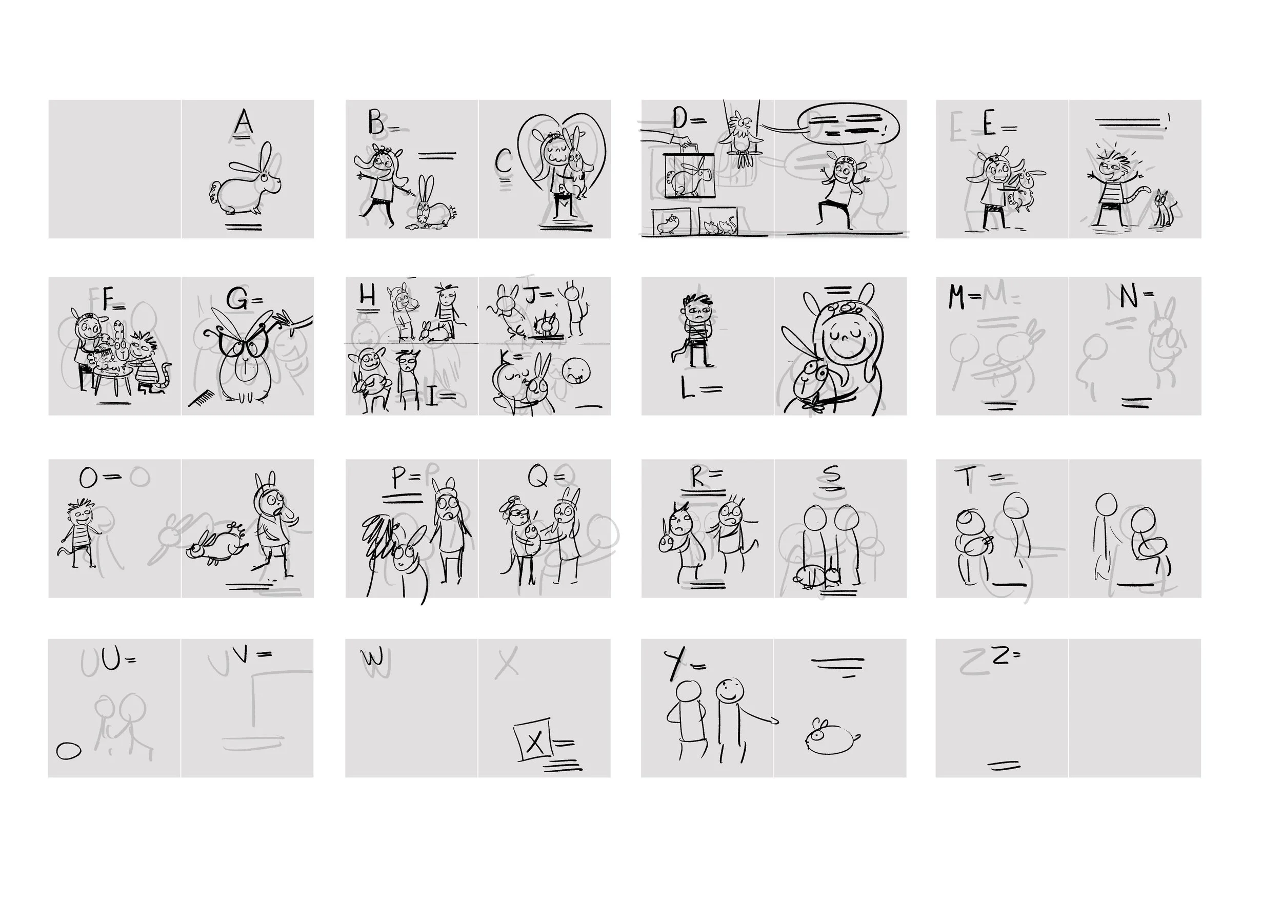
Roughs
If you look back at the finished illustrations, you can see there’s not a great deal of difference between the roughs and the final illustrations. The layout is the same - there’s just a bit more detail. I have made the line neater too, and aded texture (but not a lot).
Sometimes I prefer the roughs, because they have more energy. But I’m not brave enough to hand them in to the publisher like that… (in this case they probably are a bit too scruffy).